Content
New commemorative coins
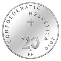

In June, two more commemorative coins were issued. This year's second silver 20 francs coin commemorates the 100th anniversary of the death of Henry Dunant, Peace Nobel Prize winner and founder of the International Committee of the Red Cross.


The golden 50 francs coin honors the painter Albert Anker who, like Dunant, died in 1910. His paintings of rural Switzerland made him one of the country's most popular painters.
For a full list of Swiss commemorative coins, refer to the Wikipedia article Gedenkmünzen der Schweiz.
New circulating coins
The speed at which new coins are put into circulation is still very high. In the past years, it wasn't uncommon that the newly minted dates were only released after several years, but now, 2010-dated coins of all denominations are found in circulation, with the exception of 2 Fr., which lags one year behind. The federal mint hasn't slowed down its production, on the contrary, this year's mintage figures are the highest in 25 years. Therefore, the demand for coins must be very high. But why? Even Swissmint can't answer this question. A news story in the Berner Zeitung (in German) is discussing this issue.
Swiss coin trivia
In the last issue of this newsletter, I was discussing the somehow confusing mint marks on the 1/2 Fr., 1 Fr. 1968 and 2 Fr. coins 1968-70. For the 5 Fr. coins, the situation is much clearer: all of them were minted in Bern, and they all bear the "B" mint mark, except for the 1970-85 issues. Since the introduction of the copper-nickel coin, there were only two other changes in appearance: In 1982, their orientation changed from coin rotation to metallic rotation. And from 1985 to 1993, the edge lettering was incuse.
 |
| Three types of edge lettering: incuse thin, incuse bold and raised |
Incuse edge lettering was seen as superior to raised letters, because it wears off more slowly. But it turned out that it was also easier to produce by counterfeiters. In the early Nineties, a large number of fake 5 Fr. coins appeared in Switzerland. All of them were of the "incuse lettering" type. Some of them showed the date 1991, even before this year's coins were officially released. This lead to the decision that this date was skipped in the order of issuance and the 1992 mintage was released instead. Furthermore, starting in 1994, the edges were produced with raised edges again, and the stock of already produced 1993 coins was held back. For this reasons, the dates 1991 and 1993 were available only in mint sets and are therefore extremely rare and expensive.
In 2004, all dates with incuse edge lettering were demonetized. They can still be redeemed at the National Bank, but they aren't legal tender anymore. In practice, it's still possible to pay with them because nobody (well, nobody except coin collectors) checks the edge or the date of a coin when accepting it, but they are hardly ever seen in circulation because the banks systematically look out for them and send them back to the National Bank.
If you're collecting Swiss coins by type, there will be basically three different copper-nickel 5 Fr. coins for you: The "coin alignment, raised edge" type (1968-81), the "medal alignment, raised edge" type (1982-84, resumed in 1994) and the "medal alignment, incuse edge" type (1985-93). If you're referring to the Krause catalog and wondering what the difference between KM# 40a.2 and 40a.4 is: There is none. So, if you're more interested in types than in catalog numbers, you can simply omit one of Krause's "types". However, if you also count the omitted mint mark as a variety, there are two "one year types" for you to collect: The 1968 (with a mint mark, unlike the others of this type) and the 1985 (the only one of its type without a mint mark). A less obvious variety (which isn't mentioned in any catalog that I know of) exists for the incuse letters: Up to 1991, they were very thin; but for 1992 (and the unissued 1993), they were made a bit bolder. The "incuse lettering" type offers yet another interesting variety: The alignment of the letters was done arbitrary, so you can find them either facing up or facing down when the portrait side is facing up. A quick glance at 14 coins showed a 11:3 majority of the "facing down" type. I don't know if this is representative, but it might be a hint that this is the more common one. In contrast, the alignment is always the same with the raised letter variety (facing down, the word "PROVIDEBIT" above the head), with the notable exception of some error coins minted in 1931 and 1967 which are even listed in the Krause catalog.
This newsletter will be published about twice a year. If you wish to be notified about new issues by e-mail, simply tell me so by writing to  and I will put you on the mailing list.
Past issues
![]() Swiss coins
Swiss coins
This is a subpage of Marcel's Coin Collection and
Marcel's Collections.
Last update: October 27 2010